[News Home]
The [News Home] components may only be used on pages built using the News Homepage page template. The availability of this page template and the associated components will be limited until the NewsCenter migration is complete. In order to feature the components accurately, this page was built with the News Homepage template. However, since this site's news feed is used for the Changelog, the site's content may not provide the best representation of these components.
[News Home] Category 3x
The [News Home] Category 3X component provides a three-column news feed filtered by a tag. For each article in the feed, the thumbnail, title, and summary are displayed, with the thumbnail and title linked to the article.
- Tag [Tag Chooser]: The tag used to filter the news feed.
- Exclude Tag [Tag Chooser] (optional): If provided, articles which include tag(s) specified in this field will not be displayed by this component.
- Heading [Short Text] (optional): If provided, replaces Tag as the heading displayed above the three columns.
Modern Campus CMS

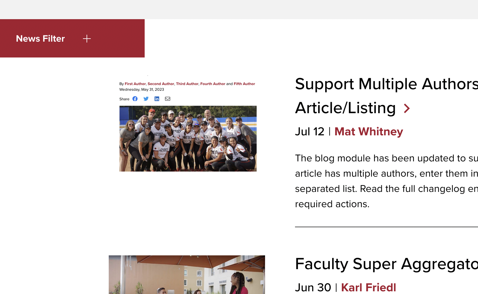
New Feed: News Carousel Component
A new version of the Feed: News Carousel Component adds the ability to set heading levels to improve accessibility and give users more flexibility in their page structure.

New Feed: News Component
A new version of the Feed: News component is being introduced to add requested functionality and give users more flexibility in their page structure.

Homepage Component Spacing Issues
An issue which caused incorrect spacing around the [Homepage] Statistics and [Homepage] Student Quotes components has been resolved.
[News Home] Category Alternate
The [News Home] Category Alternate component provides a 2x2 news feed and displays an image and CTA button in the third column.
- Tag [Tag Chooser]: The tag used to filter the news feed.
- Exclude Tag [Tag Chooser] (optional): If provided, articles which include tag(s) specified in this field will not be displayed by this component.
- Heading [Short Text] (optional): If provided, replaces Tag as the heading displayed above the three columns.
- Image [Image Chooser]: The image displayed in the third column.
- Image Description [Short Text]: Describe the image (alternative text).
Changelog
New Gadget: PDF Remediator 1.0
The PDF Remediator gadget is a specialized tool designed to help CMS users identify and fix accessibility issues in PDF files directly within the Omni CMS environment.
Last Modified Timestamp Added to Page Metadata
A last-modified meta tag has been added to the common page template. Some systems (e.g. Element451 Chatbot) can use this information to determine whether to scan the page for content updates.
New Feature: Tag-Filtered ICS Calendar Feeds
This new page template uses filtered RSS feeds to generate custom, tag-specific .ics files for use with calendar subscriptions.
Remove Custom Counters From Ordered Lists
Ordered Lists in Crimson will no longer use custom CSS counters. This will allow users to take advantage of the variety of ordered list types available in the WYSIWYG toolbar without applying even more CSS to override the templates.
[News Home] Category List
The [News Home] Category List component provides a three column list of links to the site's News List page filtered by tag. The component uses a group for the three tags, so multiple rows of links may be specified using one component.
- Heading [Short Text]: The heading displayed above the three columns.
- Categories [Group]:
- Category [Tag Chooser]: The tag used for the link in the first column.
- Category [Tag Chooser]: The tag used for the link in the second column.
- Category [Tag Chooser]: The tag used for the link in the third column.
[News Home] Featured Story
The [News Home] Featured Story component allows the editor to select a featured story and (optionally) a tag to filter a list of recent articles. The featured story's image, title, and summary span the first two columns and the recent news listing is displayed in the third column (using only the title of each article).
- Featured Story Heading [Short Text]: The heading displayed above the Featured Story.
- Featured Story [File Chooser]: Choose the story to be featured.
- Recent News Heading [Short Text]: The heading displayed above the recent articles listing.
- Recent News Tag [Tag Chooser] (optional): If provided, filters the list of recent articles.
- Recent News Exclude Tag [Tag Chooser] (optional): If provided, articles which include tag(s) specified in this field will not be displayed in the list of recent articles.
Featured Story
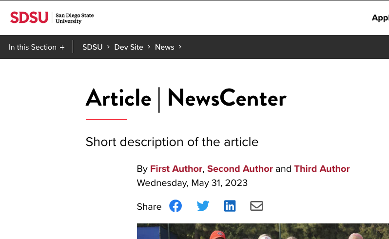
NewsCenter Article Changes
The Minimal heading style for news articles was updated to decrease the vertical whitespace. Additional changes include: featured video, social media share links, fixes for image alignment, improved appearance for the More From and Next Story features, and updates to the appearance of the News Pre-Footer.
Recent News
- California launches first-in-the-nation AI literacy initiative with SDSU leadership
- SDSU earns reaffirmation of accreditation, recognizing excellence and supporting continued growth
- Boarder Crossings brings binational skate, art and border culture to life through SDSU-led initiative
- Engineering students turn ideas into impact at Senior Design Day
- Lease agreement signed: SDSU, Chula Vista preparing for new nursing program, regional partnership
[News Home] Quote
The [News Home] Quote component allows the editor to feature a quote from a story. The article's thumbnail will be displayed in the first column while the provided quote spans the remaining two columns.
- Heading [Short Text]: The heading displayed above the thumbnail and quote.
- Article [File Chooser]: Choose the story to be featured.
- Quote [Long Text]: Specify the text to be featured (quotation marks will be added by the component).
- Attribution [Short Text] (optional): Specify who the quote should be attributed to.
Quote
Created a new section template which uses the Blank Page template for the section's index.
[News Home] Showcase
The [News Home] Showcase component allows the editor to specify articles (in groups of three) to be featured in a format similar to that provided by the [News Home] Category 3X component. In this component, the editor must specify each article to be displayed, as opposed to pulling the articles from a feed. The component allows groups of three articles to be specified, allowing the editor to display multiple rows of articles. It is recommended that all three articles be specified in each row to avoid large empty spaces in the desktop view of the page.
- Heading [Short Text]: The heading displayed above the three columns.
- Articles [Group]:
- Article [File Chooser]: Specify the article to be displayed in the first column.
- Article [File Chooser]: Specify the article to be displayed in the second column.
- Article [File Chooser]: Specify the article to be displayed in the third column.
Showcase

YouTube Hero Video Fixes
Two issues identified with using YouTube videos in the hero region of the page were fixed. Sometimes the YouTube video would fail to autoplay when the page loaded and the user would be faced with conflicting play and pause buttons. At certain browser widths on some videos, related video links would be visible.
NewsCenter List Changes
Adjusted the appearance of the News Listing page and the News Pre-Footer. The most prominent change was to make the News Filter button red instead of black. Most of the other changes were related to margins and flex alignment at different breakpoints.
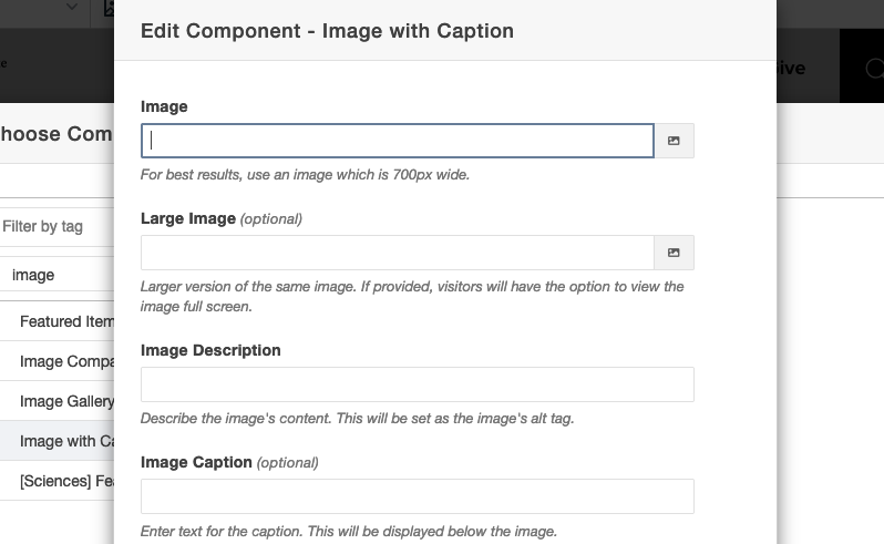
Added Size Guidance to Image with Caption Component
Added helper text to the Image with Caption component which indicates the recommended size of the image to be used.
[News Home] Videos
The [News Home] Videos component features articles which utilize the Featured Video parameter in the article's MultiEdit fields. The video for the Featured Article will be displayed spanning the first two columns, while a list of additional videos is displayed in the third column. When the user selects a video from the list, it will replace the video in the first two columns (the Featured Article's video is also the first video in the list).
- Heading [Short Text]: The heading displayed above the Featured Article's video.
- Featured Article [File Chooser]: Select the article to be featured in this section. The selected article must use the Featured Video parameter. Unfortunately, the File Chooser can not determine which articles use this parameter. The article must also specify a thumbnail to be used in the list and as a video cover image.
- Tag [Tag Chooser] (optional): If provided, this tag will be used to filter the list of videos.
- Exclude Tag [Tag Chooser] (optional): If provided, articles which include tag(s) specified in this field will not be displayed by this component.
- Number of Articles [Short Text: Numeric] (optional): Specify the number of articles to retrieve for the list of videos (not counting the featured article). If not specified, the limit will be five.
Videos
SDSU marketing professor named Zahn Professor of Creativity and Innovation

A profile in perseverance: the Alyssa Schiller story

VIIDAI: Making an impact across borders for nearly three decades

Business student clicks with early start as Lavin entrepreneur
Scientists uncover molecular trigger that turns liquid spider silk into one of nature’s strongest fibers

Chemistry Ph.D. student reflects on SDSU experience in final year of program
- 1 of 5