Content Preview
Components on this page:
Content Preview 2x
The Content Preview 2x component provides a 2-column layout to link to two pages/stories with a top-level introduction and short summary of each page/story.
- Heading [Short Text] (optional): 2 Columns Ipsum Sit H2
- Heading Level [Dropdown: h2 - h5]: Choose the heading level for the Heading (defaults to h2). If Heading is empty, this field does nothing.
- Column Title Level [Dropdown: h2 - h6]: Choose the heading level for the Column Titles (defaults to h3). This field is only used if Heading is empty. If Heading is not empty, the Column Title Level will be one level lower than the Heading Level. Column Title Level does not change the appearance of the Column Titles.
- ID [Short Text] (optional): Add an ID to be used as a link target on the page. ID must be unique on the page and use only lowercase letters, numbers, and hyphens (-). The first character must be a letter.
- Introductory Text [Long Text] (optional): Lorem ipsum dolor sit amet, consectetur adipiscing elit. Suspendisse sagittis purus venenatis nisl posuere volutpat. Aenean eu tristique dui. Orci varius natoque penatibus et magnis dis parturient montes, nascetur ridiculus mus.
- Background Color [Radio Buttons]:
- Grey
- White (Default)
- Animation [Checkbox]:
- Fade In: If checked (default), rows will fade in after the component scrolls into view. If unchecked, the content will already be in place when the component scrolls into view.
- Rows [Element Group]
- Column 1 Image [Image Chooser] (optional): URL of image or select an image from the current site.
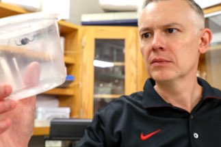
- Column 1 Image Description [Short Text] (optional): Man looking at spider in specimen container
- Column 1 Subtitle [Short Text] (optional): Optional Subtitle
- Column 1 Title [Short Text] (optional) Research Horizons: Unraveling the Mysteries of Spider Silk
- Column 1 Body [WYSIWYG] (optional): Lorem ipsum dolor sit amet, consectetur adipiscing elit. Aenean euismod bibendum laoreet. Proin gravida dolor sit amet lacus.
- Column 1 Link [File Chooser] (optional): URL of link or select a page from the current site.
- Column 2 Image [Image Chooser] (optional): URL of image or select an image from the current site.
- Column 2 Image Description [Short Text] (optional): Man looking at spider in specimen container
- Column 2 Subtitle [Short Text] (optional): Optional Subtitle
- Column 2 Title [Short Text] (optional) Research Horizons: Unraveling the Mysteries of Spider Silk
- Column 2 Body [WYSIWYG] (optional): Lorem ipsum dolor sit amet, consectetur adipiscing elit. Aenean euismod bibendum laoreet. Proin gravida dolor sit amet lacus.
- Column 2 Link [File Chooser] (optional): URL of link or select a page from the current site.
2 Columns Ipsum Sit H2
Lorem ipsum dolor sit amet, consectetur adipiscing elit. Suspendisse sagittis purus venenatis nisl posuere volutpat. Aenean eu tristique dui. Orci varius natoque penatibus et magnis dis parturient montes, nascetur ridiculus mus.


Lorem ipsum dolor sit amet, consectetur adipiscing elit. Aenean euismod bibendum laoreet. Proin gravida dolor sit amet lacus.
This is Column 1
This is Column 2
Content Preview 3x
The Content Preview 3x component provides a 3-column layout to link to three stories/pages with a top-level introduction and short summary of each story/page.
An update to this component [change log: Sep 13, 2023] added support for multiple rows. The component initially starts with one row when inserted on a page. To add more rows, click the "+ Add New Group" button (located below the component's input fields).
- Heading [Short Text] (optional): 3 Columns Ipsum Sit H2
- Heading Level [Dropdown: h2 - h5]: Choose the heading level for the Heading (defaults to h2). If Heading is empty, this field does nothing.
- Column Title Level [Dropdown: h2 - h6]: Choose the heading level for the Column Titles (defaults to h3). This field is only used if Heading is empty. If Heading is not empty, the Column Title Level will be one level lower than the Heading Level. Column Title Level does not change the appearance of the Column Titles.
- ID [Short Text] (optional): Add an ID to be used as a link target on the page. ID must be unique on the page and use only lowercase letters, numbers, and hyphens (-). The first character must be a letter.
- Introductory Text [Long Text] (optional): Lorem ipsum dolor sit amet, consectetur adipiscing elit. Suspendisse sagittis purus venenatis nisl posuere volutpat. Aenean eu tristique dui. Orci varius natoque penatibus et magnis dis parturient montes, nascetur ridiculus mus.
- Background Color [Radio Buttons]: Set the background color of the component.
- Grey (default)
- White
- Animation [Checkbox]:
- Fade In: If checked (default), rows will fade in after the component scrolls into view. If unchecked, content will already be in place when the component scrolls into view.
- Rows [Element Group]:
- Column 1 Image [Image Chooser] (optional): URL of the image or select an image from the current site.
- Column 1 Image Description [Short Text] (optional): description of the image
- Column 1 Subtitle [Short Text] (optional): [Omitted in this example]
- Column 1 Title [Short Text] (optional): Research Horizons: Unraveling the Mysteries of Spider Silk
- Column 1 Body [WYSIWYG] (optional): Lorem ipsum dolor sit amet, cons ectetur adipiscing elit. Aen ean euismod bibendum laoreet.
- Column 1 Link [File Chooser] (optional): URL for the page/story or select a page on the current site.
- Column 2 Image [Image Chooser] (optional): URL of the image or select an image from the current site.
- Column 2 Image Description [Short Text] (optional): description of the image
- Column 2 Subtitle [Short Text] (optional): [Omitted in this example]
- Column 2 Title [Short Text] (optional): Research Horizons: Unraveling the Mysteries of Spider Silk
- Column 2 Body [WYSIWYG] (optional): Lorem ipsum dolor sit amet, cons ectetur adipiscing elit. Aen ean euismod bibendum laoreet.
- Column 2 Link [File Chooser] (optional): URL for the page/story or select a page on the current site.
- Column 3 Image [Image Chooser] (optional): URL of the image or select an image from the current site.
- Column 3 Image Description [Short Text] (optional): description of the image
- Column 3 Subtitle [Short Text] (optional): [Omitted in this example]
- Column 3 Title [Short Text] (optional): Research Horizons: Unraveling the Mysteries of Spider Silk
- Column 3 Body [WYSIWYG] (optional): Lorem ipsum dolor sit amet, cons ectetur adipiscing elit. Aen ean euismod bibendum laoreet.
- Column 3 Link [File Chooser] (optional): URL for the page/story or select a page on the current site.
3 Columns Ipsum Sit H2
Lorem ipsum dolor sit amet, consectetur adipiscing elit. Suspendisse sagittis purus venenatis nisl posuere volutpat. Aenean eu tristique dui. Orci varius natoque penatibus et magnis dis parturient montes, nascetur ridiculus mus.

Lorem ipsum dolor sit amet, cons ectetur adipiscing elit. Aen ean euismod bibendum laoreet.

Lorem ipsum dolor sit amet, cons ectetur adipiscing elit. Aen ean euismod bibendum laoreet.
Three Columns x Two Rows
Lorem ipsum dolor sit amet, consectetur adipiscing elit. Suspendisse sagittis purus venenatis nisl posuere volutpat. Aenean eu tristique dui. Orci varius natoque penatibus et magnis dis parturient montes, nascetur ridiculus mus.

Duis aute irure dolor in reprehenderit in voluptate velit esse cillum dolore eu fugiat nulla pariatur.

Ut enim ad minim veniam, quis nostrud exercitation ullamco laboris nisi ut aliquip ex ea commodo consequat.

Lorem ipsum dolor sit amet, consectetur adipiscing elit, sed do eiusmod tempor incididunt ut labore et dolore magna aliqua.

Excepteur sint occaecat cupidatat non proident, sunt in culpa qui officia deserunt mollit anim id est laborum.

Lorem ipsum dolor sit amet, consectetur adipiscing elit, sed do eiusmod tempor incididunt ut labore et dolore magna aliqua.

Ut enim ad minim veniam, quis nostrud exercitation ullamco laboris nisi ut aliquip ex ea commodo consequat.
Content Preview 3x Short
The Content Preview 3x Short component provides the ability to link to 3 stories/pages with images and titles, along with a top-level heading which can also be a link.
- Heading [Short Text] (optional): Centers & Institutes
- Heading Level [Dropdown: h2 - h6]: Choose the heading level for the Heading (defaults to h2). Heading Level does not change the appearance of the Heading. If Heading is empty, this field does nothing.
- ID [Short Text] (optional): Add an ID to be used as a link target on the page. ID must be unique on the page and use only lowercase letters, numbers, and hyphens (-). The first character must be a letter.
- Heading Link Destination [File Chooser] (optional): URL for link or select a page on the current site
- Center 1 Text [Short Text]: Center for Clinical and Cognitive Neuroscience
- Center 1 Link Destination [File Chooser]: URL for link or select a page on the current site
- Center 1 Image [Image Chooser]: URL for image or select an image on the current site
- Center 1 Image Description [Short Text]: Description of the image
- Center 2 Text [Short Text]: Center for Clinical and Cognitive Neuroscience
- Center 2 Link Destination [File Chooser]: URL for link or select a page on the current site
- Center 2 Image [Image Chooser]: URL for image or select an image on the current site
- Center 2 Image Description [Short Text]: Description of the image
- Center 3 Text [Short Text]: Center for Clinical and Cognitive Neuroscience
- Center 3 Link Destination [File Chooser]: URL for link or select a page on the current site
- Center 3 Image [Image Chooser]: URL for image or select an image on the current site
- Center 3 Image Description [Short Text]: Description of the image
Fontawesome Preview 3x
The Fontawesome Preview 3X component enables user to incorporate Fontawesome icons into a 3-item grid layout in lieu of photo-based or graphic images.
- Header [Short Text] (optional): Heading to set the component's context
- Heading Level [Dropdown: h2, h3, h4, h5]: Sets heading levels (defaults to h2) if Header is provided and Column Titles will be set to Heading Level + 1. If Header is not used, this setting will be ignored in favor of Column Title Heading Level.
- Column Title Heading Level [Dropdown: h2, h3, h4, h5, h6]: Sets heading levels (defaults to h3) for the Column Titles if Header is not provided.
- ID [Short Text] (optional): Allows the user to add an ID to use as a link target on the page. ID must be unique on the page and use only lowercase letters, numbers, and hyphens (-). The first character of the ID must be a lowercase letter.
- Animation [Checkbox: Fade In]: If checked, the content will fade in as the component scrolls into view. The user may want to uncheck this option if the component is used near the top of the page, where this behavior could be confusing, since the content won't appear until the user scrolls the page, even if the content is in the visible region.
- Introductory Text [Long Text] (optional): Some additional text to guide the user into the content.
- Columns [Element Group]: Add, remove, or rearrange the icons and related content grouped into a series of columns. Columns will be arranged in rows of 3 on large browser widths.
- Icon Name [Short Text]: The FontAwesome v5 class name for the icon.
- Subtitle [Short Text] (optional): The subtitle is presented between the icon and the Title.
- Title [Short Text] (optional): The title is presented in bold text.
- Link [File Chooser] (optional): The URL or file to be linked to the icon.
- Body [WYSIWYG] (optional): The content to close out the column.
Header
Introductory Text
This is the body for column 1.
Since it is WYSIWYG, we can put pretty much anything here.