Snippets
[WYSIWYG] Content Container
Any content not in another snippet or component must be placed in a [WYSIWYG] Content Container snippet to receive the correct styling.
Accordion
The Accordion snippet creates an "accordion" or series of hidden content regions on the page with links which expose/hide the content regions.
- Heading (optional): A heading which precedes the accordion, styled to generally match an H2 in the WYSIWYG.
- Heading Level (2-5) Set the heading level for Heading to H2 - H5. The appearance of the heading will not change. If Heading is empty, this value will be used to set the heading level for the Heading of the individual Accordion Items. If Heading is not empty, the Accordion Items will use Heading Level + 1 (H3 - H6).
- Introduction (optional): Introductory text preceding the accordion.
- Accordion ID (optional): An ID to assign to the accordion itself, usually for use in a URL fragment to link directly to the accordion. May use lowercase letters, numbers, dashes (-), and underscores (_). Do not use spaces or other special characters.
- Expand a Panel on Load: Specify the number of a panel to expand when the page loads. If set to 0 (the default), none of the panels will be expanded on load.
- Accordion Items
- Heading: The text displayed in the link which activates the accordion item
- Content: The content which will be displayed when the accordion item is open
- ID (optional): An ID to be applied to the heading. Refer to Accordion ID for character limitations.
Accordion Ipsum Sit H2
Ipsum dolor sit amet, consetetur sadipscing elitr, sed diam nonumy eirmod tempor invidunt ut labore et dolore magna aliquyam erat, sed diam voluptua. At vero eos et accusam et justo duo dolores et ea rebum. Stet clita kasd gubergren, no sea takimata sanctus est Lorem ipsum dolor sit amet. Lorem sadipscing elitr, sed diam nonumy eirmod tempor invidunt ut labore et dolore magna aliquyam erat, sed diam voluptua.illum dolore eu feugiat nulla facilisis at vero eros et accumsan et iusto odio dignissim qui
Accordion headings will be Heading Level +1, so headings in the Content area should start at Heading Level +2 (unless the main accordion Heading is empty, in which case headings in the Content should be +1).
Heading 4
You can enter content freely. for an accordion panel.
When heading is empty, the panel does not output.
Even when you skip a row, you want to go off by the number indicated in the heading column when you are setting a specific panel to open on load.
Ipsum dolor sit amet, consetetur sadipscing elitr, sed diam nonumy eirmod tempor invidunt ut labore et dolore magna aliquyam erat, sed diam voluptua. At vero eos et accusam et justo duo dolores et ea rebum. Stet clita kasd gubergren, no sea takimata sanctus est Lorem ipsum dolor sit amet. Lorem sadipscing elitr, sed diam nonumy eirmod tempor invidunt ut labore et dolore magna aliquyam erat, sed diam voluptua.illum dolore eu feugiat nulla facilisis at vero eros et accumsan et iusto odio dignissim qui
Editor's Note
The Editor's Note snippet creates a brief note for content editors which will only be visible in the CMS' edit view. An example is included in this page, but as expected it will only be visible on the published page due to the inclusion of some screenshots for illustrative purposes.
- Title: Some text at the beginning of the note, displayed as bold text followed by a colon (:)
- Content: The content of the note.
- Text Color: The color to be used for the text. Please ensure that there is sufficient contrast with the Background Color.
- Background Color: The color to be used as the background for the note. Please ensure that there is sufficient contrast with the Text Color.
Gallery Slider
The Gallery Slider snippet creates an image gallery (sometimes called a carousel) which allows the user to page through a short collection of images with captions. The snippet supports up to 4 or 5 images.
- Header An H2 heading prior to the slider
- ID (optional): Add an ID to be used as a link target on the page. ID must be unique on the page and use only lowercase letters, numbers, and hyphens (-). The first character must be a letter.
- Introduction An introductory paragraph placed before the slider
- Slides
- Image The image displayed in the slide
- Content Content/caption displayed in the slide
- ID (optional) An ID to assign to the list item. May use lowercase letters, numbers, dashes (-), and underscores (_). Do not use spaces or other special characters.
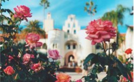
Carousel Ipsum Sit H2
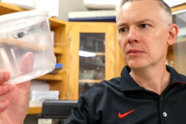

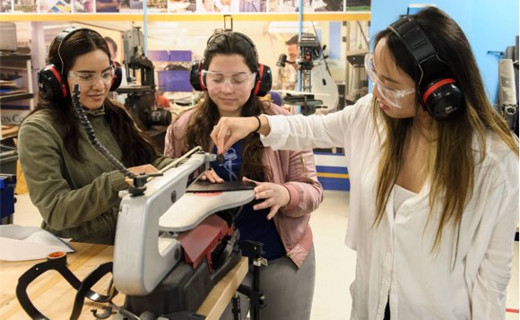
Image List
The Image List snippet...
- Header (optional) An H2 heading preceding the Image List
- ID (optional): Add an ID to be used as a link target on the page. ID must be unique on the page and use only lowercase letters, numbers, and hyphens (-). The first character must be a letter.
- Introduction (optional) An introductory paragraph preceding the Image List
- Image List
- Image The image to display in the list
- Title The Title for this list item. Optionally, the title may be a link
- Subtitle (optional) A short subtitle which will be displayed above the Title
- Body WYSIWYG text displayed below the title
- ID (optional) An ID to assign to the list item. May use lowercase letters, numbers, dashes (-), and underscores (_). Do not use spaces or other special characters.
Image List Ipsum Sit H2
Title without link

Another Title without link
Programs List
The Programs List snippet...
- Header H2 Heading for the Programs List
- Heading Level Change the heading level for the header (h2 - h6)
- ID (optional): Add an ID to be used as a link target on the page. ID must be unique on the page and use only lowercase letters, numbers, and hyphens (-). The first character must be a letter.
- Introduction Introductory Paragraph for the Programs List
- Programs
- Program Name A link to the program with the program's name as the link text
- Program Type The program type
- ID (optional) An ID to assign to the program. May use lowercase letters, numbers, dashes (-), and underscores (_). Do not use spaces or other special characters.