Changelog

Homepage Component Spacing Issues
Jun 3An issue which caused incorrect spacing around the [Homepage] Statistics and [Homepage] Student Quotes components has been resolved.

New Gadget: PDF Remediator 1.0
Apr 8The PDF Remediator gadget is a specialized tool designed to help CMS users identify and fix accessibility issues in PDF files directly within the Omni CMS environment.

Last Modified Timestamp Added to Page Metadata
Mar 20A last-modified meta tag has been added to the common page template. Some systems (e.g. Element451 Chatbot) can use this information to determine whether to scan the page for content updates.
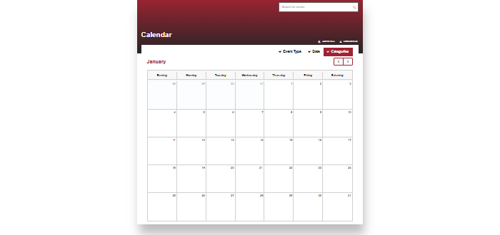
New Feature: Tag-Filtered ICS Calendar Feeds
Feb 10This new page template uses filtered RSS feeds to generate custom, tag-specific .ics files for use with calendar subscriptions.
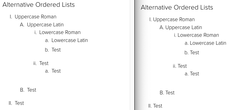
Remove Custom Counters From Ordered Lists
Sep 25Ordered Lists in Crimson will no longer use custom CSS counters. This will allow users to take advantage of the variety of ordered list types available in the WYSIWYG toolbar without applying even more CSS to override the templates.

Hero Space Component Accessibility
Aug 14The [Homepage] Hero Space component has been updated with support for a video transcript, improved focus styles, alt text on the play/pause button changes to match state, and users with reduced motion preferences enabled will now be able to play the video (it will be paused by default for these users, video should auto-play for other users).
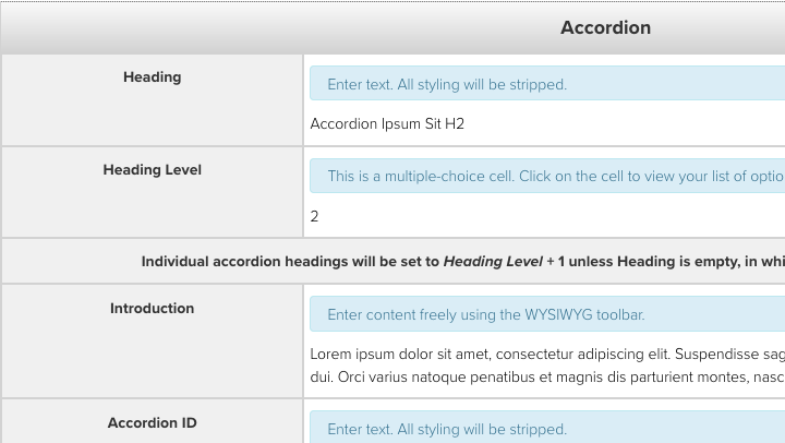
Accordion Titles Now Wrapped in Headings
Jul 23The Accordion snippet has been updated to wrap the button/title of each accordion item in a heading. This should provide the content structure most people would expect from an accordion.
Crimson Menu V2 Deployed to Production and How to Preview on Your Site
Jun 3Crimson Menu V2 has been deployed to the production environment. Follow the steps below to install and preview the new design on Crimson websites. The live preview feature allows site owners to test the design and functionality of the menus on a website before switching over to the new version.

Focus Behavior Fixed on Components/Snippets with IDs and the "Skip to content" Link
May 29A manual accessibility evaluation of the SDSU homepage conducted by a firm contracted by the CSU found an error in the behavior of the "Skip to content" link included on all pages in the Crimson templates. While fixing this issue, we found a related issue with all components and snippets which have an ID assigned to them, so we have fixed both issues.

Merged Link Grid Components and Added IDs
May 16The Link Grid and Link Grid - Set Columns components have been merged into a single Link Grid component. Ten components have been updated to support adding an ID to create a link target.