Changelog
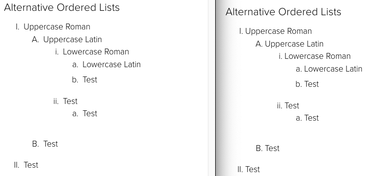
Remove Custom Counters From Ordered Lists
Sep 25Ordered Lists in Crimson will no longer use custom CSS counters. This will allow users to take advantage of the variety of ordered list types available in the WYSIWYG toolbar without applying even more CSS to override the templates.
Hero Space Component Accessibility
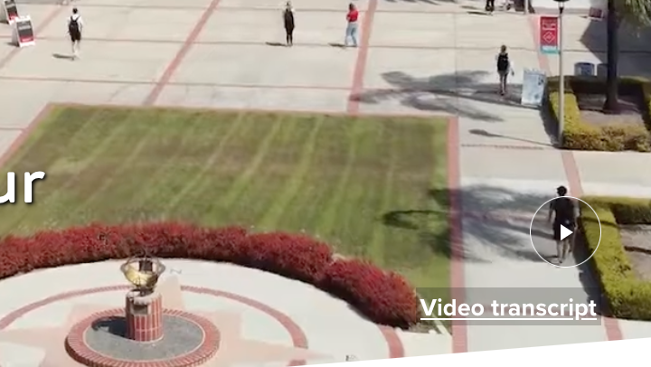
Aug 14The [Homepage] Hero Space component has been updated with support for a video transcript, improved focus styles, alt text on the play/pause button changes to match state, and users with reduced motion preferences enabled will now be able to play the video (it will be paused by default for these users, video should auto-play for other users).
Accordion Titles Now Wrapped in Headings
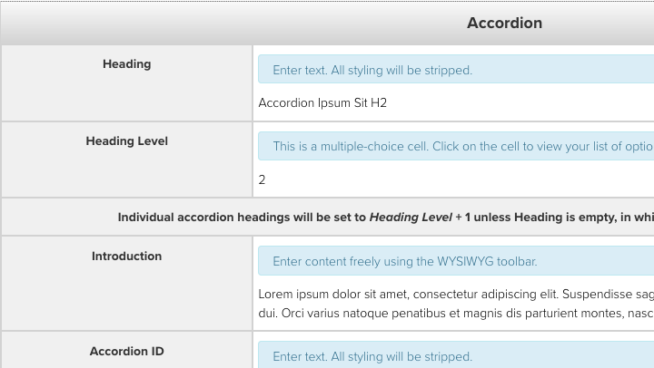
Jul 23The Accordion snippet has been updated to wrap the button/title of each accordion item in a heading. This should provide the content structure most people would expect from an accordion.
Focus Behavior Fixed on Components/Snippets with IDs and the "Skip to content" Link
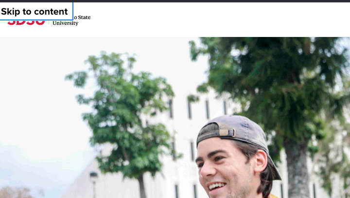
May 29A manual accessibility evaluation of the SDSU homepage conducted by a firm contracted by the CSU found an error in the behavior of the "Skip to content" link included on all pages in the Crimson templates. While fixing this issue, we found a related issue with all components and snippets which have an ID assigned to them, so we have fixed both issues.
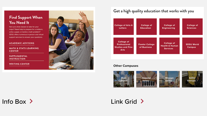
Merged Link Grid Components and Added IDs
May 16The Link Grid and Link Grid - Set Columns components have been merged into a single Link Grid component. Ten components have been updated to support adding an ID to create a link target.
ID and Heading Level Support in Calendar Feeds
Apr 22The Feed: Calendar Events - Omni Calendar and Feed: Calendar Events - Manual components have been updated to support adding an ID and changing the Heading Level for the main Heading. When the Large Heading option is enabled, the change in Heading Level will not affect the appearance of the component. If the Large Heading option is not used, the heading will take on the appearance of the selected Heading Level. The appearance of the headings used for the individual event titles will not change, though they will be set to the appropriate heading level one higher than the selection.
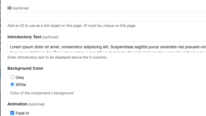
ID Support Added to Components and Snippets
Apr 21Added support for an ID to use as a link target in multiple components and snippets.
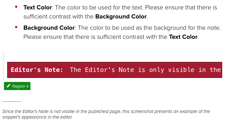
Editor's Note Snippet
Apr 16A snippet has been added to the CMS to allow content editors to leave notes in the editor which will not be included in the Preview window or the published page.
Change Heading Levels in Featured Items + Large Image Component
Apr 10In the ongoing series of feature improvements, the Featured Items + Large Image component now has options for setting the heading levels and an ID.
Share Link Added to News Article
Apr 9News articles with the Include Share Links option enabled now have the option to add a link with custom text and URL after the existing Facebook, Twitter, LinkedIn, and email icons.

