Changelog
Change Heading Levels in Featured Items + Large Image Component
Apr 10In the ongoing series of feature improvements, the Featured Items + Large Image component now has options for setting the heading levels and an ID.

Share Link Added to News Article
Apr 9News articles with the Include Share Links option enabled now have the option to add a link with custom text and URL after the existing Facebook, Twitter, LinkedIn, and email icons.
Heading Level Settings Changed
Apr 9A number of components have been identified which used headings in a manner which was similar enough to the normal presentation of headings that the user might expect their size to be representative of that heading's level within the page's outline. In these cases, we've decided to remove the CSS which applied only to these headings to improve the user experience.
Heading Changes for FontAwesome Preview 3x Component
Apr 8The FontAwesome Preview 3x component has been updated to allow changing the heading levels within the component as well as adding an ID to use as a link target.

Contact Box Heading Options
Apr 4The Contact Box + CTA Buttons component has been updated to support changing the heading levels and adding an ID to use as a link target on the page.
Heading Settings for Featured Items 3x + Statistics Component
Apr 3The Featured Items 3x + Statistics component has been modified to add two new options: Heading Level and ID. These options allow users to set the level of the optional Heading and add an ID to the Heading so links can target the component within the page.
Support for Composite News Feeds
Mar 26News feeds allow the specification of multiple external URLs to create a composite news feed from multiple sources.
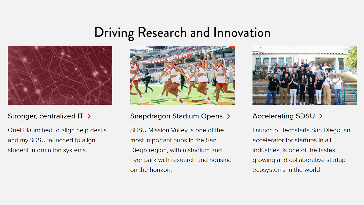
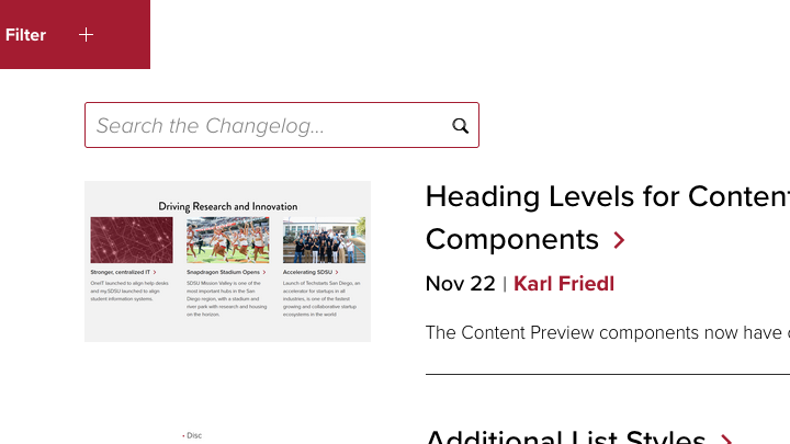
Heading Levels for Content Preview Components
Nov 22The Content Preview components now have options to set the heading levels.
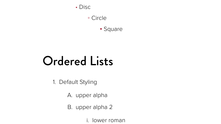
Additional List Styles
Oct 22A variety of new style options are now available for both ordered and unordered lists.
Add Button Role to Lightbox Links
Oct 18Scans indicated that the Image Gallery and Image with Caption components had accessibility issues when linking to a larger version of the image in a lightbox. Adding the appropriate role to the links to indicate that they behave as buttons addresses the issue.