Heading Level Settings Changed
A number of components and snippets have been identified which used headings in a manner which was similar enough to the normal presentation of headings that the user might expect their size to be representative of that heading's level within the page's outline. In these cases, we've decided to remove the CSS which applied only to these headings to improve the user experience.
What Does This Mean?
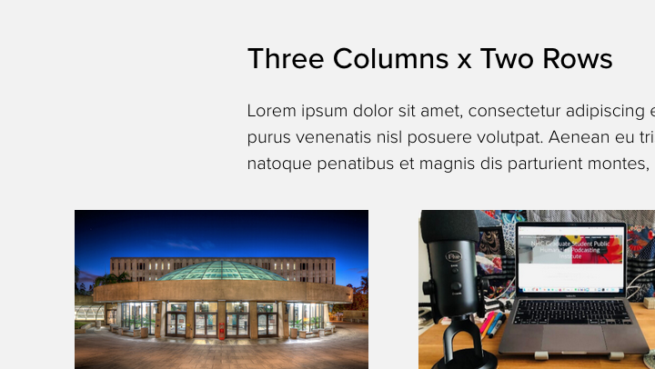
Some of the headings within some of the components and snippets will now use the default styling for headings, so an h2, h3, h4, etc. will look the same as it would in a [WYSIWYG] Content Container snippet. The majority of the changed headings follow a Header/Intro pattern which displays this optional content before the main component region.
The modified components and snippets include, but may not be limited to:
- Accordion
- Content Preview 2x
- Content Preview 3x (as in the image accompanying this article)
- Featured Item Panel
- Featured Item Panel Expanded
- Featured Items + Large Image
- Featured Items 3x + Statistics
- Feed: News Carousel - some style options
- Gallery Slider
- Image List
- Link Grid with White Background
- Programs List
- Statistics Highlights 3x
- Welcome Message
No Action Required
You may wish to review the use of components on your pages to ensure the presentation of the content isn't negatively effected by this change.