Snippets are a form of reusable content that users can use on any page in Modern Campus CMS. Each snippet has fields that must be filled out in order to use it. A list of all of the snippets in the Crimson templates can be found on the Crimson snippets page.
How to Access Snippets
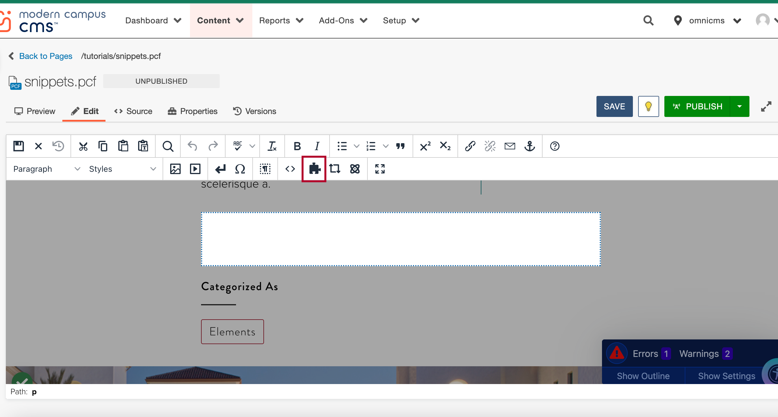
To access snippets use the puzzle piece icon (Insert Snippet button in the toolbar).
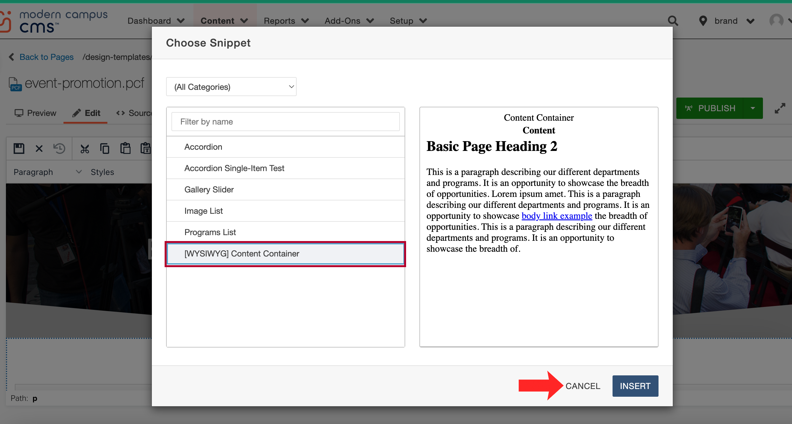
The "Choose Snippet" dialog will list all the available snippets. Once you have selected your desired snippet you may use the insert button to confirm your selection or the cancel button to exit without making changes.
To add a WYSIWYG content container use the snippet puzzle piece icon (insert snippet) which will pop up the snippet selection menu and select the WYSIWYG Content Container and use the Insert button to add it to your page.
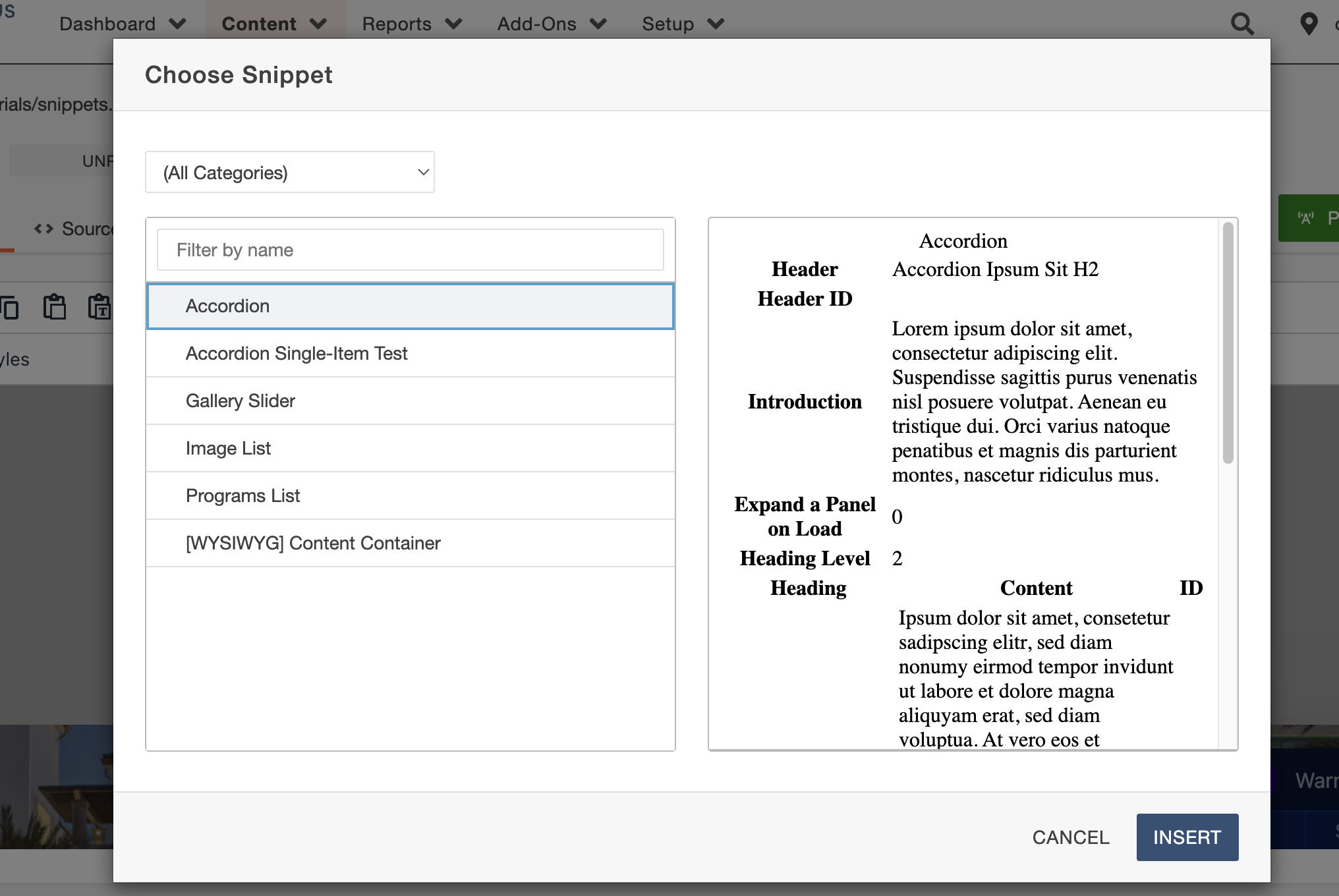
Another snippet we can use on pages is the accordion snippet.
To access this snippet go to the snippet puzzle piece icon (insert snippet) to view the entire snippet library. Select the accordion and use the insert button to add it to your page.
The accordion will load in the form of a table with editable regions in both columns. For the top portion you will be able to edit the information for a header, headerID, introduction text, expand a panel on load.
Header: An H2 heading which precedes the accordion
Header ID: An ID to assign to the header, usually for use in a URL fragment to link directly to the accordion. May use lowercase letters, numbers, dashes (-), and underscores (_). Do not use spaces or other special characters.
Introduction: Introductory text preceding the accordion
Expand a Panel on Load: Specify the number of a panel to expand when the page loads. (Usually set to 0 unless you specifically need a piece of content to op out)
Accordion Items
Heading: The text displayed in the link which activates the accordion item
Content: The content which will be displayed when the accordion item is open
ID: (optional) An ID to be applied to the heading. Refer to Header ID for recommended character limitations.
 Open the image full screen.
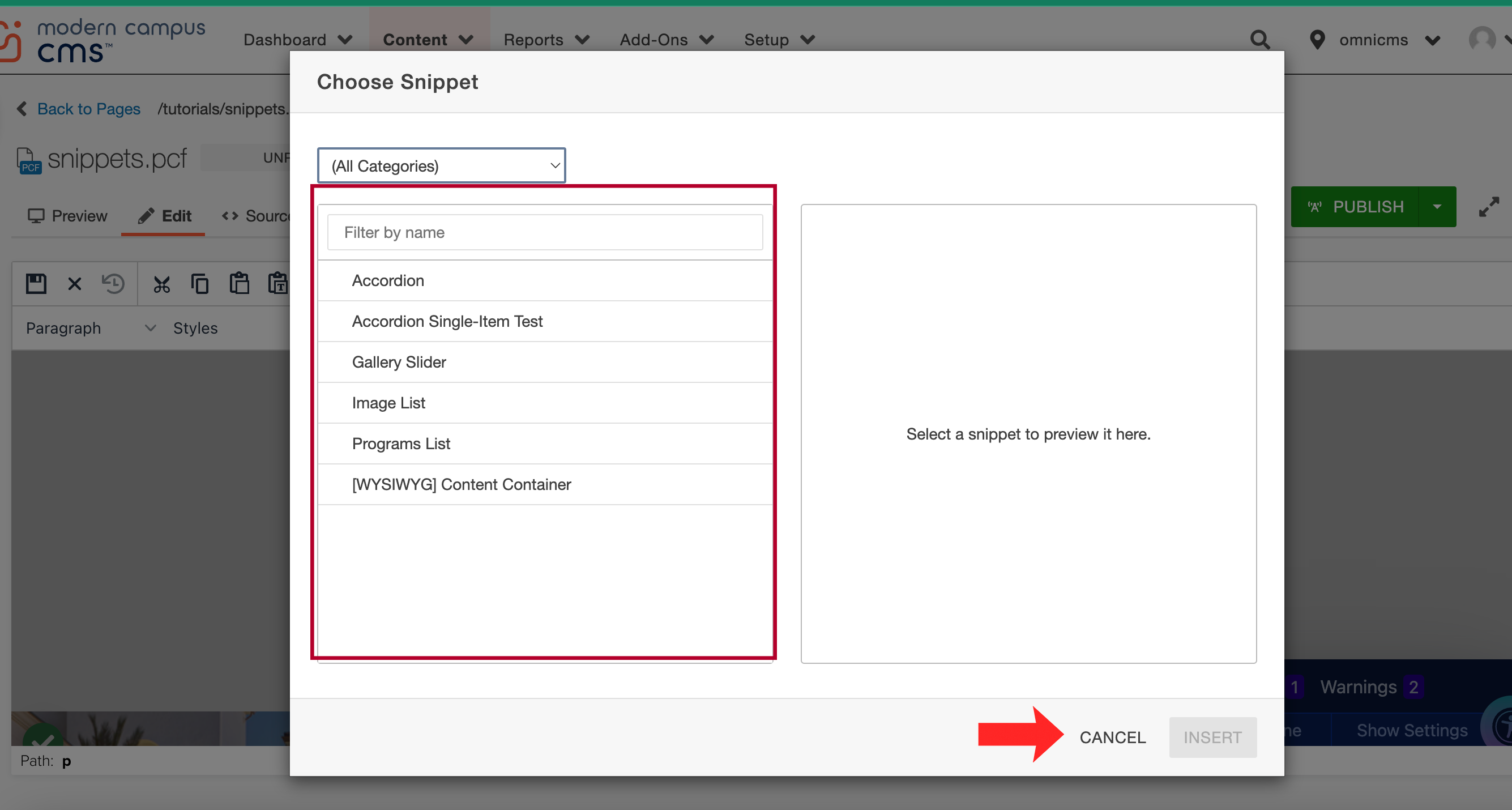 Open the image full screen.
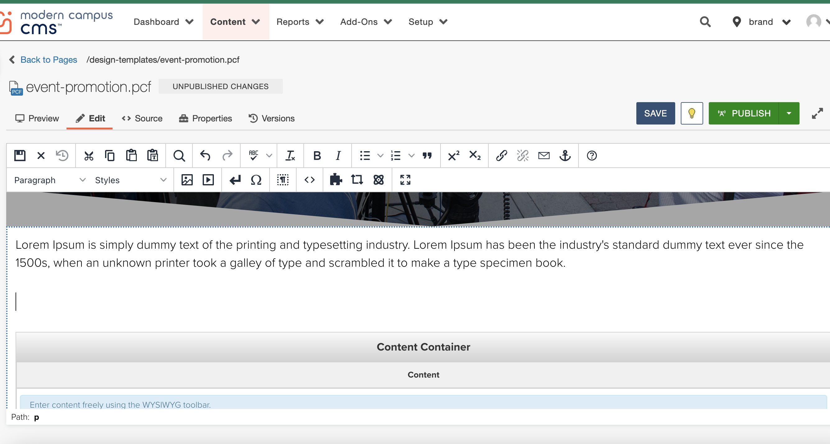
 Open the image full screen.
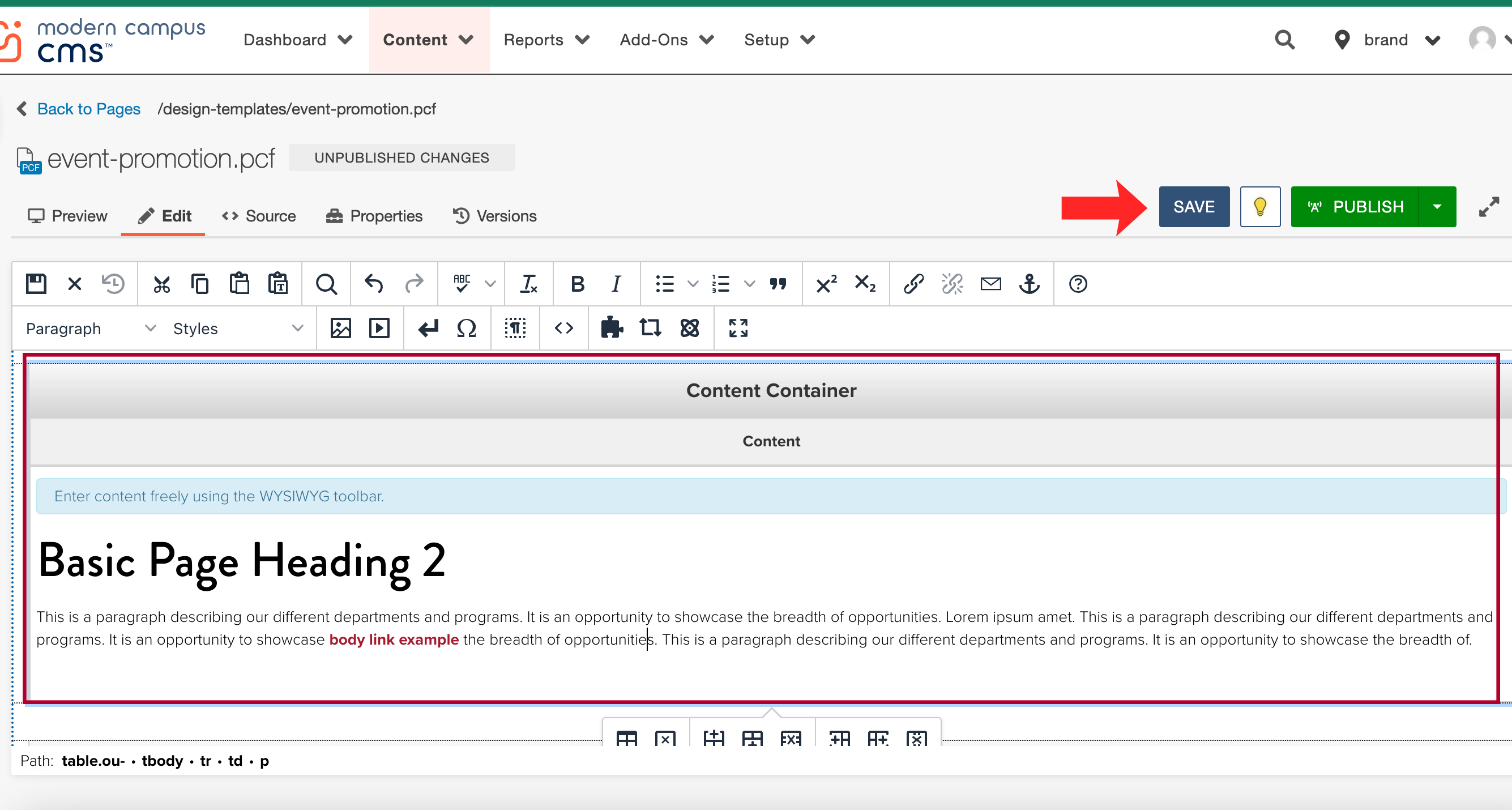
 Open the image full screen.
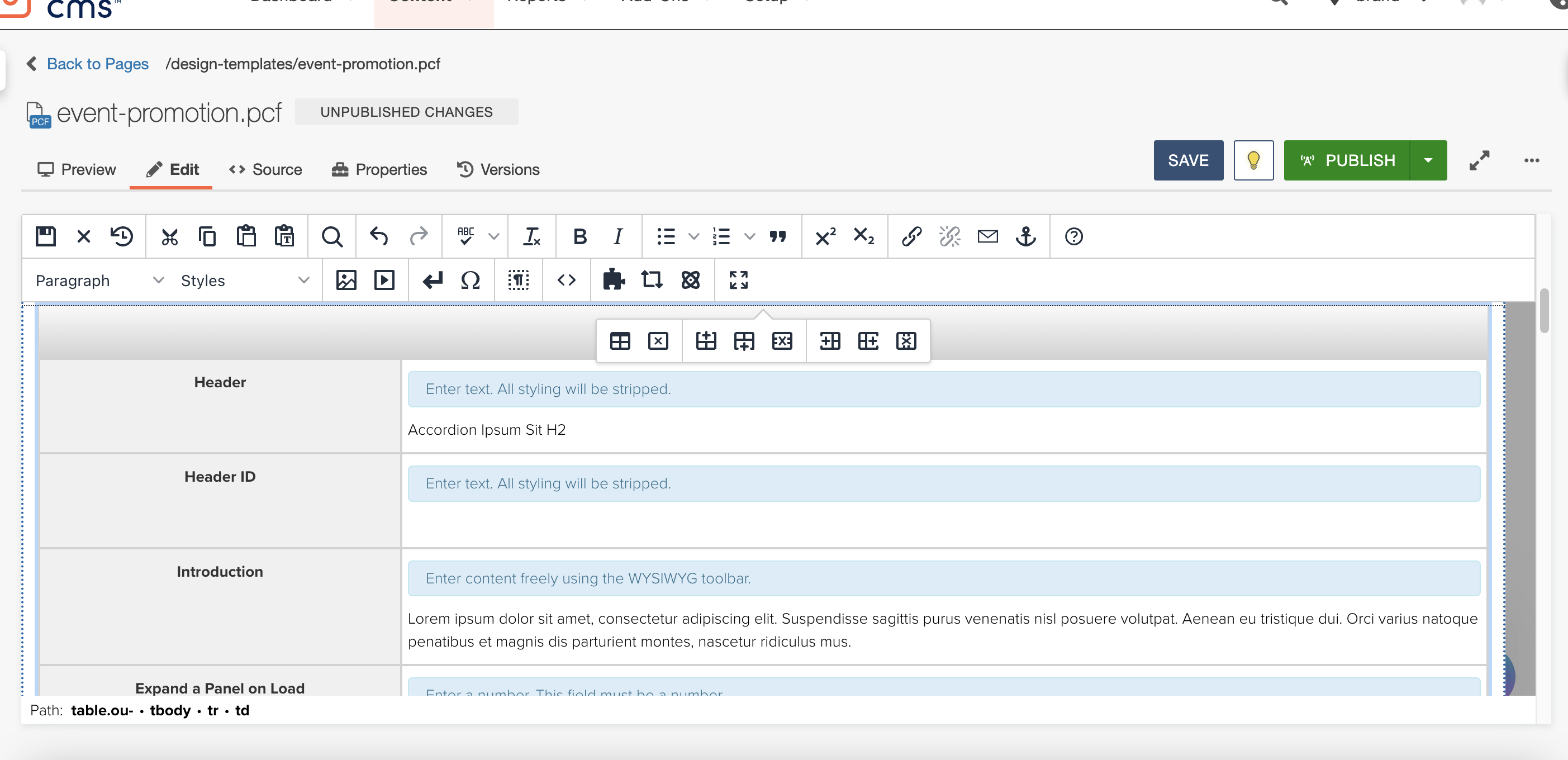 Open the image full screen.
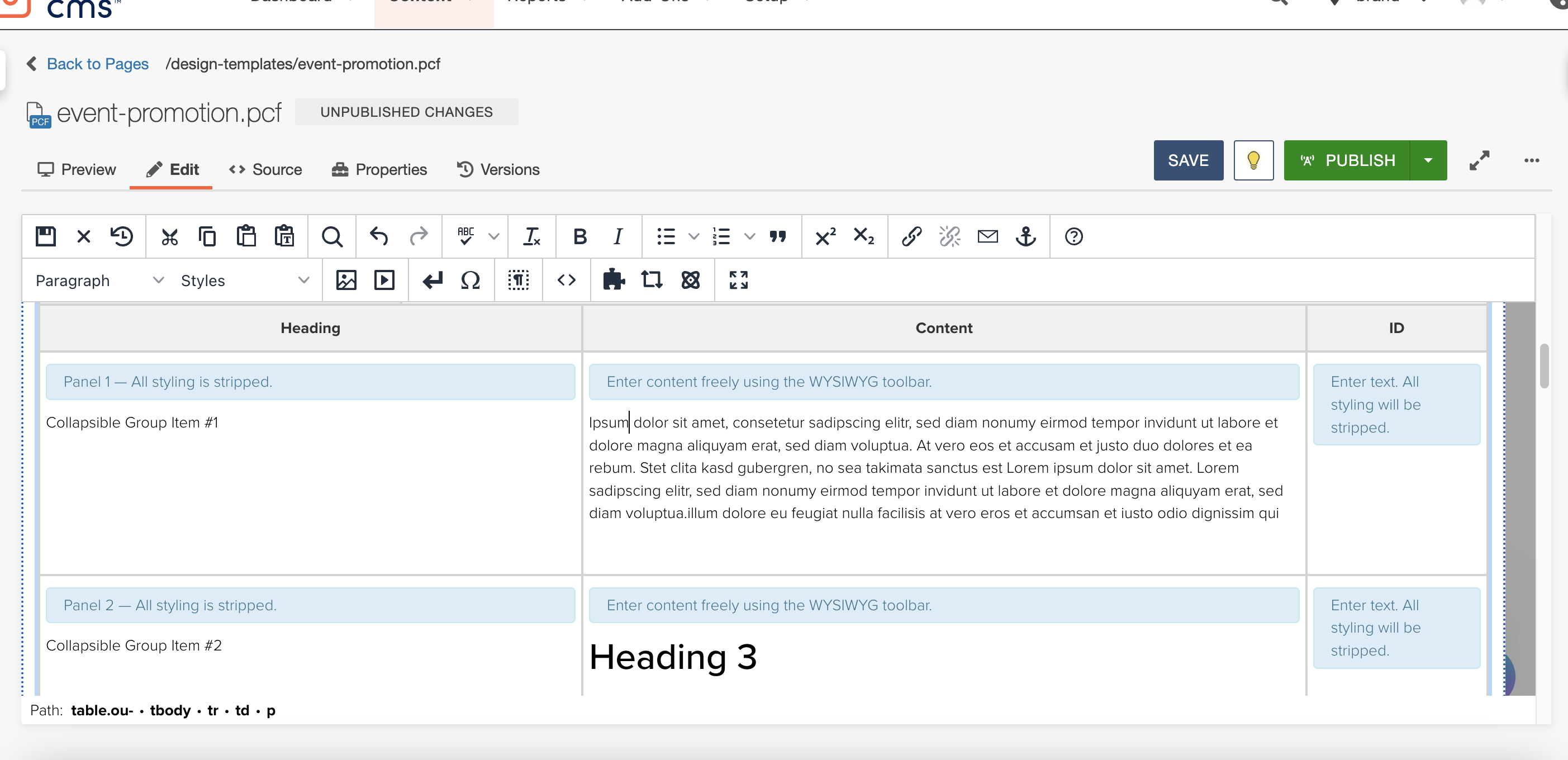 Open the image full screen.
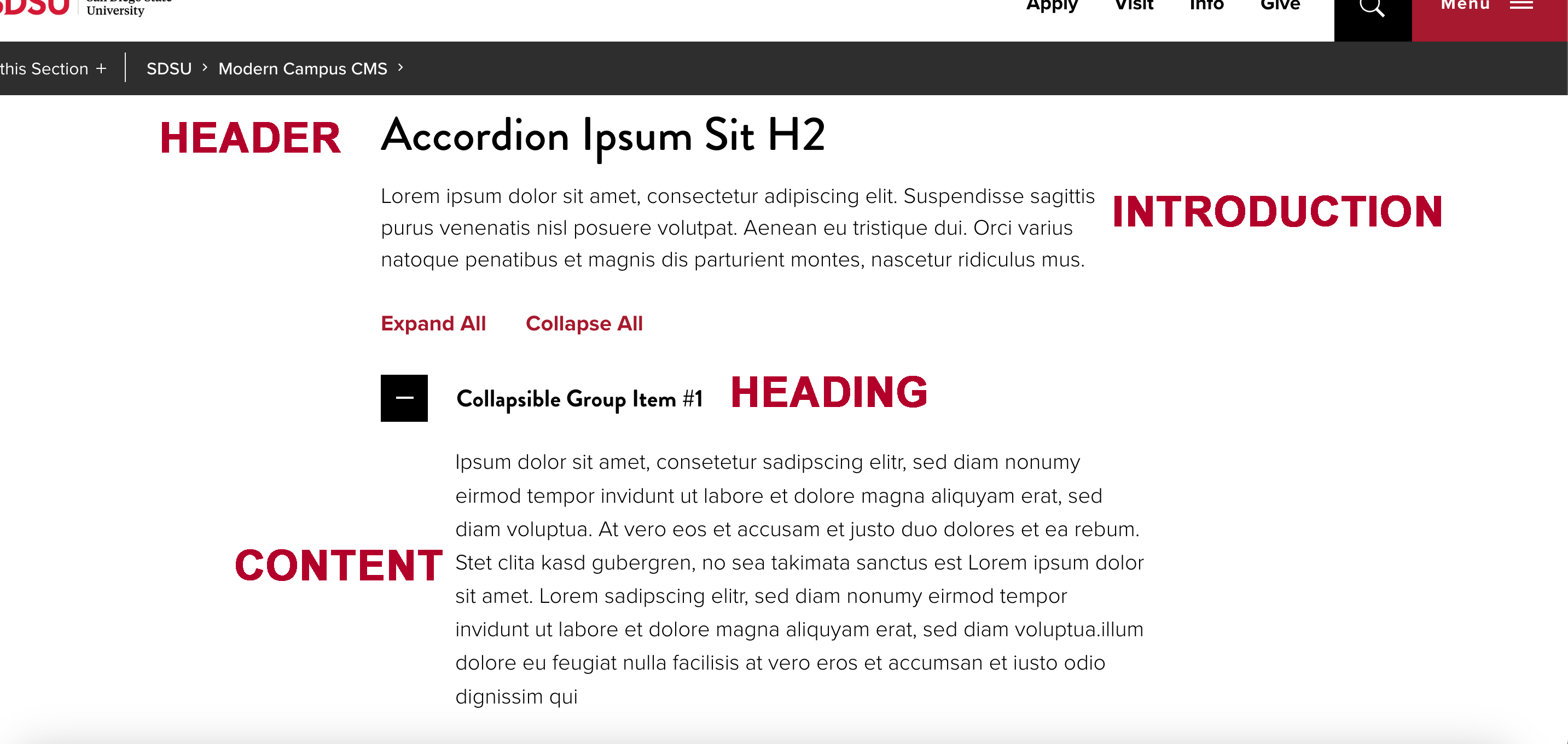 Open the image full screen.