[News Home]
The [News Home] components may only be used on pages built using the News Homepage page template. The availability of this page template and the associated components will be limited until the NewsCenter migration is complete. In order to feature the components accurately, this page was built with the News Homepage template. However, since this site's news feed is used for the Changelog, the site's content may not provide the best representation of these components.
[News Home] Category 3x
The [News Home] Category 3X component provides a three-column news feed filtered by a tag. For each article in the feed, the thumbnail, title, and summary are displayed, with the thumbnail and title linked to the article.
- Tag [Tag Chooser]: The tag used to filter the news feed.
- Exclude Tag [Tag Chooser] (optional): If provided, articles which include tag(s) specified in this field will not be displayed by this component.
- Heading [Short Text] (optional): If provided, replaces Tag as the heading displayed above the three columns.
Omni CMS
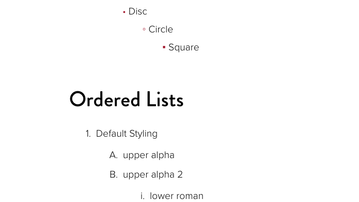
Additional List Styles
A variety of new style options are now available for both ordered and unordered lists.

Add Button Role to Lightbox Links
Scans indicated that the Image Gallery and Image with Caption components had accessibility issues when linking to a larger version of the image in a lightbox. Adding the appropriate role to the links to indicate that they behave as buttons addresses the issue.

Image Gallery Asset Updated to Match Component
The output of the Image Gallery Asset has been updated to match the output of the Image Gallery Component. This will ensure some consistency in this design element when people choose to use the asset. Please note that using an Image Gallery Asset is still not recommended.
[News Home] Category Alternate
The [News Home] Category Alternate component provides a 2x2 news feed and displays an image and CTA button in the third column.
- Tag [Tag Chooser]: The tag used to filter the news feed.
- Exclude Tag [Tag Chooser] (optional): If provided, articles which include tag(s) specified in this field will not be displayed by this component.
- Heading [Short Text] (optional): If provided, replaces Tag as the heading displayed above the three columns.
- Image [Image Chooser]: The image displayed in the third column.
- Image Description [Short Text]: Describe the image (alternative text).
Changelog
[News Home] Category List
The [News Home] Category List component provides a three column list of links to the site's News List page filtered by tag. The component uses a group for the three tags, so multiple rows of links may be specified using one component.
- Heading [Short Text]: The heading displayed above the three columns.
- Categories [Group]:
- Category [Tag Chooser]: The tag used for the link in the first column.
- Category [Tag Chooser]: The tag used for the link in the second column.
- Category [Tag Chooser]: The tag used for the link in the third column.
[News Home] Featured Story
The [News Home] Featured Story component allows the editor to select a featured story and (optionally) a tag to filter a list of recent articles. The featured story's image, title, and summary span the first two columns and the recent news listing is displayed in the third column (using only the title of each article).
- Featured Story Heading [Short Text]: The heading displayed above the Featured Story.
- Featured Story [File Chooser]: Choose the story to be featured.
- Recent News Heading [Short Text]: The heading displayed above the recent articles listing.
- Recent News Tag [Tag Chooser] (optional): If provided, filters the list of recent articles.
- Recent News Exclude Tag [Tag Chooser] (optional): If provided, articles which include tag(s) specified in this field will not be displayed in the list of recent articles.
Featured Story
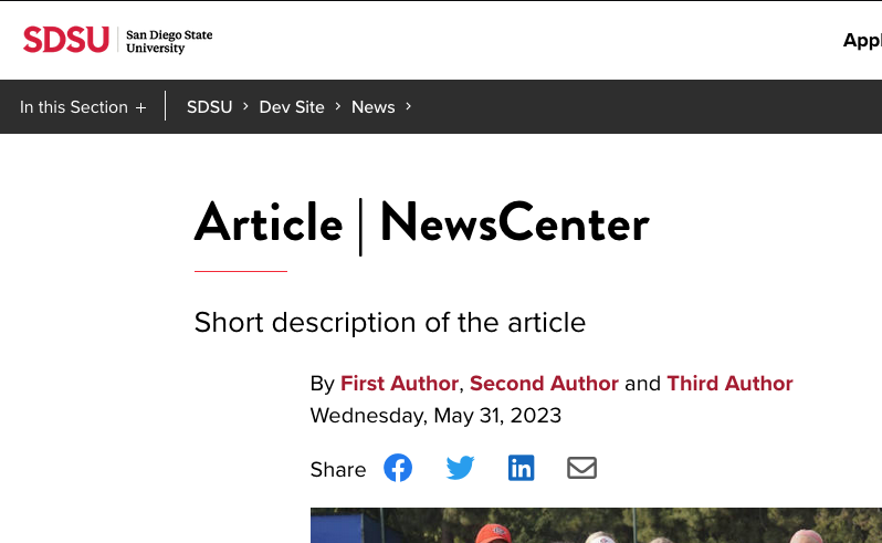
NewsCenter Article Changes
The Minimal heading style for news articles was updated to decrease the vertical whitespace. Additional changes include: featured video, social media share links, fixes for image alignment, improved appearance for the More From and Next Story features, and updates to the appearance of the News Pre-Footer.
Recent News
[News Home] Quote
The [News Home] Quote component allows the editor to feature a quote from a story. The article's thumbnail will be displayed in the first column while the provided quote spans the remaining two columns.
- Heading [Short Text]: The heading displayed above the thumbnail and quote.
- Article [File Chooser]: Choose the story to be featured.
- Quote [Long Text]: Specify the text to be featured (quotation marks will be added by the component).
- Attribution [Short Text] (optional): Specify who the quote should be attributed to.
Quote
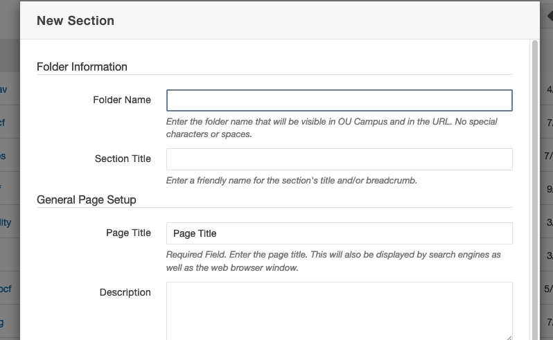
Created a new section template which uses the Blank Page template for the section's index.
[News Home] Showcase
The [News Home] Showcase component allows the editor to specify articles (in groups of three) to be featured in a format similar to that provided by the [News Home] Category 3X component. In this component, the editor must specify each article to be displayed, as opposed to pulling the articles from a feed. The component allows groups of three articles to be specified, allowing the editor to display multiple rows of articles. It is recommended that all three articles be specified in each row to avoid large empty spaces in the desktop view of the page.
- Heading [Short Text]: The heading displayed above the three columns.
- Articles [Group]:
- Article [File Chooser]: Specify the article to be displayed in the first column.
- Article [File Chooser]: Specify the article to be displayed in the second column.
- Article [File Chooser]: Specify the article to be displayed in the third column.
Showcase

YouTube Hero Video Fixes
Two issues identified with using YouTube videos in the hero region of the page were fixed. Sometimes the YouTube video would fail to autoplay when the page loaded and the user would be faced with conflicting play and pause buttons. At certain browser widths on some videos, related video links would be visible.
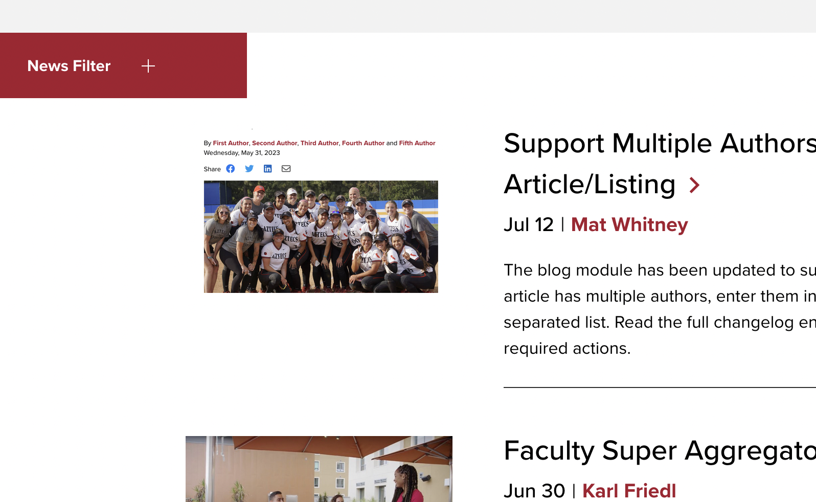
NewsCenter List Changes
Adjusted the appearance of the News Listing page and the News Pre-Footer. The most prominent change was to make the News Filter button red instead of black. Most of the other changes were related to margins and flex alignment at different breakpoints.
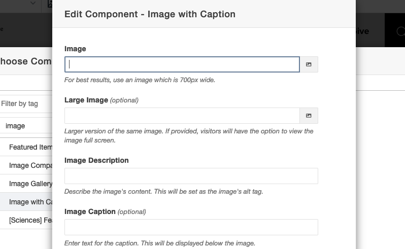
Added Size Guidance to Image with Caption Component
Added helper text to the Image with Caption component which indicates the recommended size of the image to be used.
[News Home] Videos
The [News Home] Videos component features articles which utilize the Featured Video parameter in the article's MultiEdit fields. The video for the Featured Article will be displayed spanning the first two columns, while a list of additional videos is displayed in the third column. When the user selects a video from the list, it will replace the video in the first two columns (the Featured Article's video is also the first video in the list).
- Heading [Short Text]: The heading displayed above the Featured Article's video.
- Featured Article [File Chooser]: Select the article to be featured in this section. The selected article must use the Featured Video parameter. Unfortunately, the File Chooser can not determine which articles use this parameter. The article must also specify a thumbnail to be used in the list and as a video cover image.
- Tag [Tag Chooser] (optional): If provided, this tag will be used to filter the list of videos.
- Exclude Tag [Tag Chooser] (optional): If provided, articles which include tag(s) specified in this field will not be displayed by this component.
- Number of Articles [Short Text: Numeric] (optional): Specify the number of articles to retrieve for the list of videos (not counting the featured article). If not specified, the limit will be five.


