Changelog
Header/Footer Hovered Link Contrast Fixes
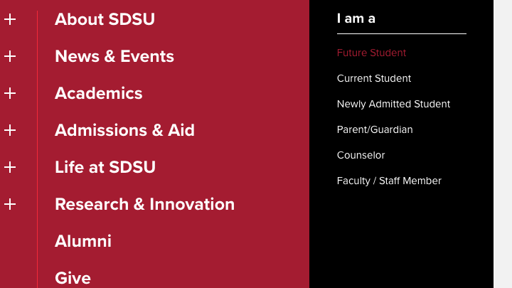
Oct 6In the main menu, breadcrumbs, In this Section menu, and the footer, when the user hovered their mouse over links, the links would turn red. While the red color was chosen in part for its contrast level on white backgrounds, these areas are gray, black, or red. To improve accessibility, text links in these areas will no longer change colors on hover. Instead, the text will become underlined when the user hovers over the text to reinforce that they are links and visually indicate which link is currently under the cursor.
Heading Level Options Added to Featured Text + Chevron Component
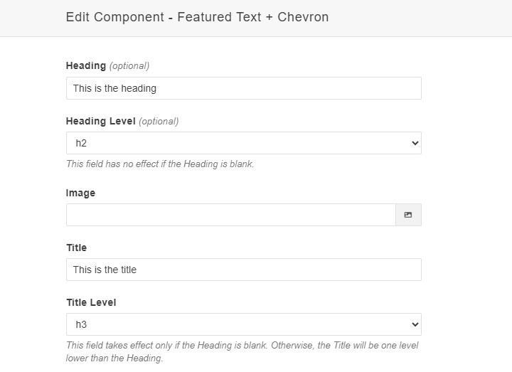
Oct 5The Featured Text + Chevron component has been updated with options to set the heading level (h2,h3,h4,h5,h6) of the component's Heading and Title fields.
Don't Exclude Pages from sitemap.xml
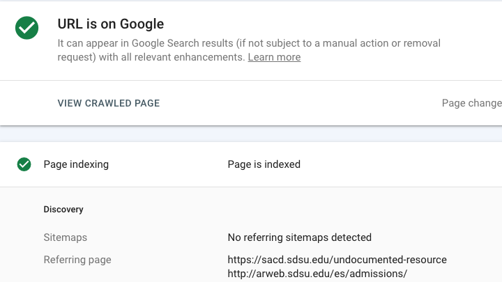
Oct 5This update changes the New Page Template for most page types to include the files in the sitemap.xml. News Articles, Faculty/Contact Profiles, Program Detail pages, and Redirects are still excluded from the sitemap.xml by default.
Remove dev- Prefix from Canonical URL
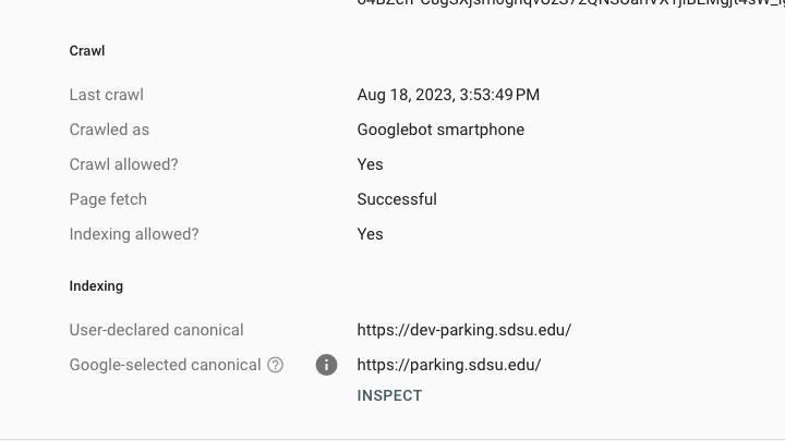
Oct 3The "dev-" prefix will no longer be included in the canonical URL meta tag when pages are published from websites in development. This will prevent the need to republish all of the pages when the site goes live and the prefix is removed from the subdomain. It will also help to prevent the "dev-" subdomain from showing up in search results.
[News Home] Category Components Updated
Sep 25The [News Home] Category Alternate and [News Home] Category 3X components have been updated to modify the presentation of their "More from" links to be more consistent with each other. The CTA button was removed from the Category Alternate component and replaced with a "More from" link in the same style as the one on the [News Home] Category 3X component. Both links also feature an arrow after the link text to provide an additional visual indication that it is a link.
News Homepage
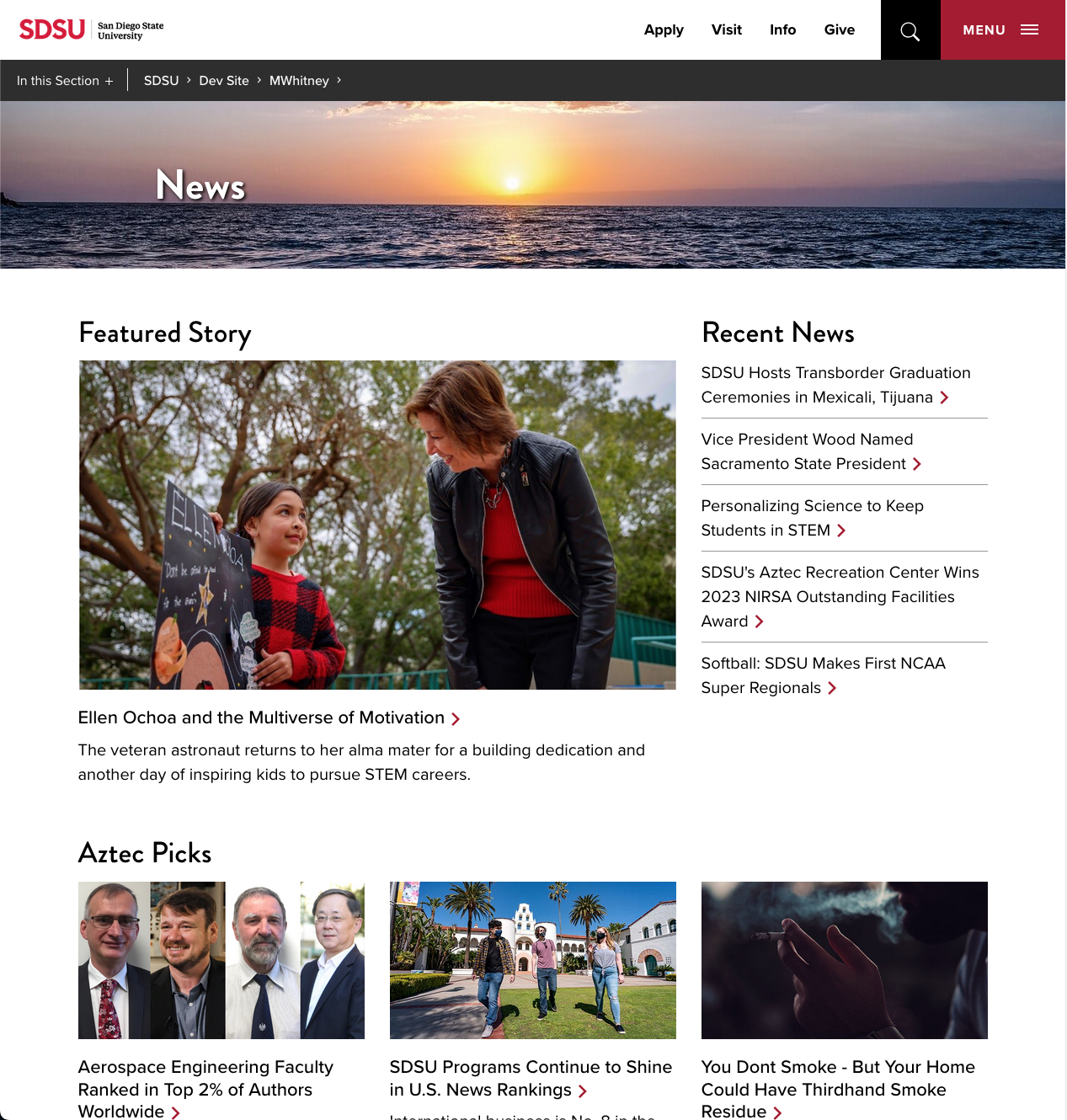
Sep 15The News Homepage and associated components will be available when the NewsCenter migration is complete. These combine to offer a variety of new ways to feature news stories and feeds.
Accordion Snippet's Default Expanded Panel Changed to Zero
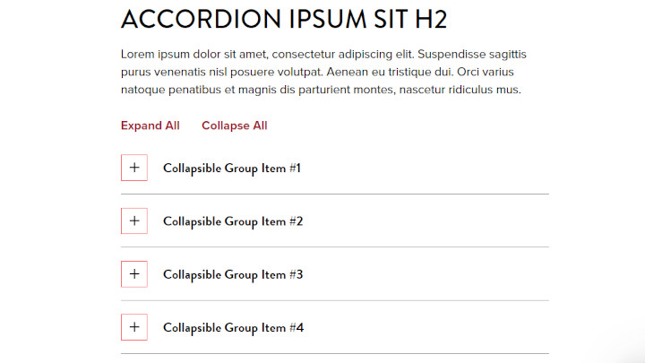
Sep 14The Accordion snippet's Expand a Panel value was set by default to 2, causing the second panel to expand on page load. This value has been changed to 0 so that all panels are collapsed by default (which is the most common behavior).
Support for Multiple Rows Added to Content Preview 3x Component
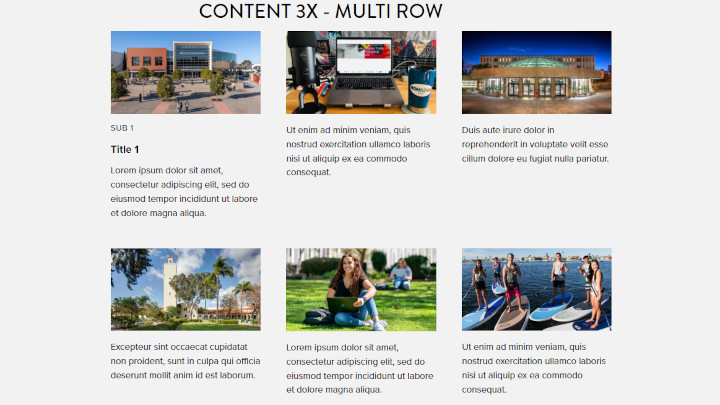
Sep 13Added support for multiple rows to the Content Preview 3x component.
Profile Component Fixed to Hide Email, Phone, and Office When Not Selected
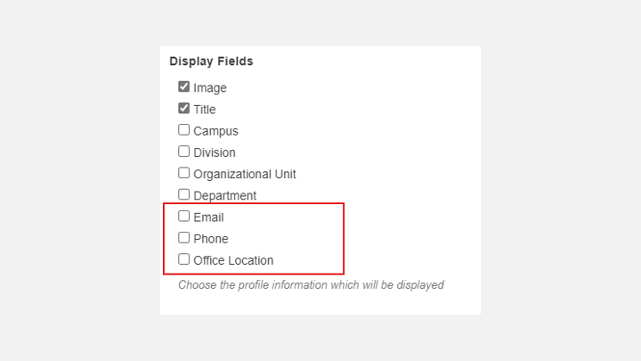
Aug 10Fixed a bug in the Profile component that was causing it to display the email address, phone number, and office location even when those options were not selected.
Options for Background Color Added to Content Preview 2x and 3x Components
Jul 20A new field to change the background color to either white or grey has been added to the Content Preview 2x, Content Preview 3x, and Content Preview 3x Short components.

![Updated Style for the More From link in the [News Home] Category Alternate component](/changelog/_images/271-more-from-link-style.png)
